CSS Grid - Cards Layout & Aspect Ratio
Dec 30, 2019- css
- grid
- cards
- layout
Card-based layouts have been around in web design for longer than you may think and grown in popularity over the years. A lot of platforms have been using card based layouts for years now. Cue meme
There are many ways to implement card based layouts using flexbox, css grid or good ol' float☠. But we'll be using CSS Grid to make your life easy as a front-end developer.
Markup
Let's use un-ordered list for our card based layout but you can also use div as well.
1<ul>2 <li></li>3 <li></li>4 <li></li>5 <li></li>6 <li></li>7</ul>
Styles
Our goal is to make a layout that is structured in a grid of cards. Let's introduce CSS Grid to the mix. We'll have to define container ul as grid based container to do that we'll be adding the display property to it and setting it to the value of grid.
1ul {2 display: grid;3}
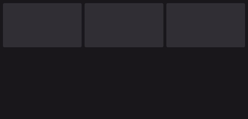
With CSS Grid you can set how many columns you want in the layout using property grid-template-columns.
1ul {2 grid-template-columns: 1fr 1fr 1fr;3}
This will create a 3 column layout, here fr represents a fraction of the total width the container spans. We can also use values in px, em, rem and percentages instead of fr. We set each column to 1fr and repeating it 3 times creates 3 columns for us but in case where you want to build equal width column layouts you can use repeat() to avoid repeating yourself😉
1ul {2 grid-template-columns: repeat(3, 1fr);3}
Replace the first argument that repeat takes with number of columns you want. Second argument is the width each column will have. Now let's introduce some gutter in case you want some. To do that we can use grid-gap property.
1ul {2 grid-gap: 16px;3}
This will add gutters of 16px wide to both columns and rows. To set different gutter to columns and rows you can either use grid-row-gap and grid-column-gap or set grid-gap to <grid-row-gap> <grid-column-gap> to assign different gutter sizes.
1ul {2 grid-gap: 16px 12px;3}
or
1ul {2 grid-row-gap: 16px;3 grid-column-gap: 12px;4}
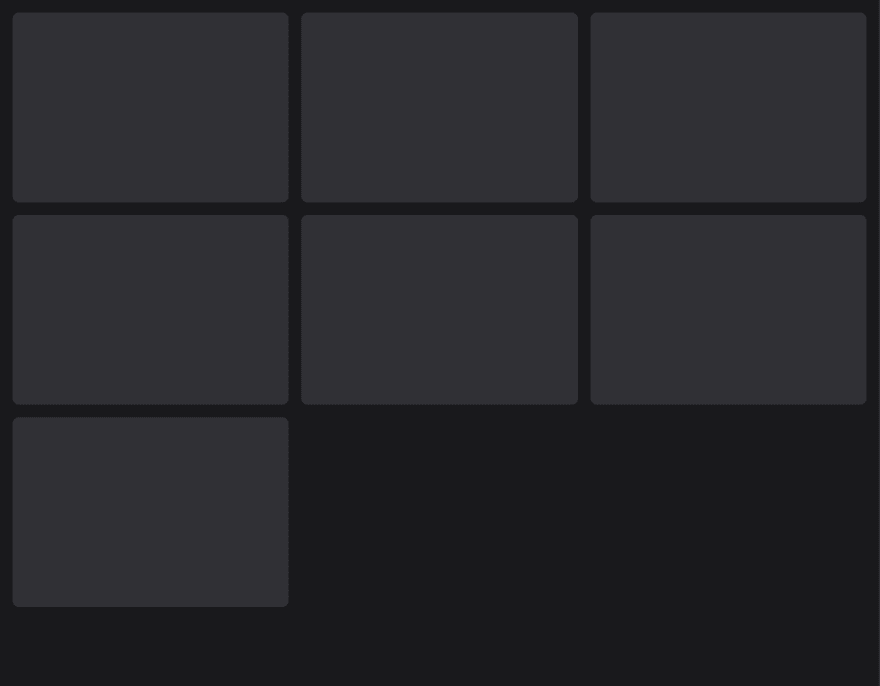
But what if you want the layout to have as many number of columns that can fit the window and wrap on browser resize?
Let's welcome auto-fill and auto-fit to the game.
What's auto-fill?
auto-fill will simply fill the row with as many cards it can and will create empty columns if the number of cards are less than the number of columns.
1ul {2 grid-template-columns: repeat(auto-fill, minmax(320px, 1fr));3}
minmax() takes two arguments -
- First - Minimum Width
- Second - Maximum Width The cards will expand as much as maximum width they have in a row until the space for new card becomes available in the row.
What's auto-fit
auto-fit will fill the row with as many cards as it can fit with maximum width. If a row has space to fill 10 cards of maximum width of 100px, it will fit all of them and the cards will wrap to new row if the row doesn't have space to fit a card with it's minimum width.
For more detailed difference between
auto-fillandauto-fitrefer to this article by @SaraSoueidan Now for the purpose of this articles we'll be usingauto-fill. With this included our css for the container has following properties.
1ul {2 display: grid;3 grid-gap: 16px;4 grid-template-columns: repeat(auto-fill, minmax(320px, 1fr));5}
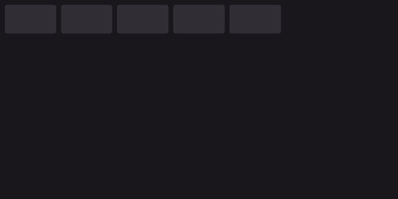
Now let's style our cards a bit. We'll begin by adding background color to the body tag and some padding too.
1body {2 padding: 16px;3 background: #19191c;4}
For our cards represented by li tags, let's style 'em.
1li {2 height: 240px;3 background: #303035;4 border-radius: 8px;5}
Our layout so far look's like this.
Aspect Ratio
On some screens the layout might look good with fixed height but as the screen size increases or for wide devices the cards will stretch horizontally but the height will be not. To avoid this we can setup aspect ratio for our cards that'll keep them in same ratio no matter how wide or how small a screen is. Now to simulate aspect ratio on our cards we can set the height property to auto or simply remove it.
We'll be using padding-top or padding-bottom to simulate a particular aspect ratio. Below are the values that we can use to achieve different aspect ratios.
- 1:1 - 100%
- 16:9 - 56.25%
- 4:3 - 75%
- 3:2 - 66.66%
- 8:5 - 62.5% Let's make our cards fit to 16:9 ratio.
1li {2 padding-top: 56.25%;3 background: #303035;4 border-radius: 8px;5}
With this added we'll have our cards at 16:9 ratio no matter the size of the screen. But any content within the cards would now have been pushed down by the padding we added. To solve this we can wrap the content of the cards into a container and set it to position: absolute. With this we can position our content at the top of the card.
1li {2 padding-top: 56.25%;3 background: #303035;4 border-radius: 8px;5 position: relative;6}7li > img {8 position: absolute;9 width: 100%;10}
All styles together
1body {2 padding: 16px;3 background: #19191C;4}5ul {6 display: grid;7 grid-gap: 16px;8 grid-template-columns: repeat(auto-fill, minmax(320px, 1fr));9}10li {11 padding-top: 56.25%;12 background: #303035;13 border-radius: 8px;14 position: relative;15}16li > img {17 position: absolute;18 width: 100%;19}
CSS Grid pretty much handles the responsive part for us which I see as absolute win but since we set minimum width for our cards to 320px which means if the window's size is less than that the cards will overflow. So we'll have to use media queries nonetheless🤦🏼♂️
1@media screen and (max-width: 320px) {2 ul {3 grid-template-columns: repeat(auto-fill, minmax(100%, 1fr));4 }5}